From Canva:
They say you should never judge a book by its cover, and the same rule should probably apply for music.
We all know that we should probably pay more attention to what’s inside the box rather than outside, but it’s just a matter of fact that a beautiful exterior design can make the interior just that little bit better.
01. Colour Me Cohesive


This sleek album cover was actually designed by the musician himself, Tycho, also known as Scott Hansen. The design is built on a strong colour scheme, showcased in sharp geometric shapes, and each colour has been made to correspond to a track. Creating a strong palette that can be used cohesively with the content can make for a pretty effective design.
02. Explore Die Cutting


Die cutting is used to create cut-out areas in your design, and when used correctly it can create a unique depth to your design. Check out the geometric die cutting done in this album sleeve from David Marsh, that allows for the two-tone cover to peek through, adding a sophisticated extra layer to the design.
03. Why Not Pop-Up?


Who said pop-up pictures were just for childrens’ books? This example fromTyler Stout pairs fully illustrated cover art with a pop-up picture of the artists, just quirky enough to capture the comedic tone and genre of the music.
04. Use The Whole Canvas


When it comes to album cover design, it is easy to consider the design from the standpoint of each panel being separate. But another option is to embrace the entire length of the case, just as Kamil Borowski has done in the example. Instead of limiting your artwork to just the front panel, consider extending it to expand over the width of the case, and perhaps even across the disc, just as has been done in this example, to create a larger image.
05. Get Creative With Packaging


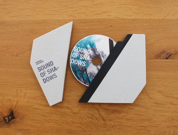
Why is it that round albums have to come in perfectly square boxes? Being a bit creative with the shape of your packaging can really help highlight your design and give it a unique physical presence on the CD rack. Check out this angular album cover packaging by inCentea, that goes against almost everything you thought you knew about album cases.
06. Get Interactive


Consider how your audience will interact with your design, and how this interaction can be enhanced upon. Bonus points if this interactive element ties directly into the album title, as this heat-sensitive cover designed by Modo ties into the title “The Second Law”, referencing the second law of thermodynamics.
Check out lots more here.


